Menu

THE VANISHING HALF

THE VANISHING HALF

THE VANISHING HALF

Behind
The Scenes

Behind
The
Scenes

  • Donny Jiang Unsplash
  • Siednji Leon Unsplash
  • Gabriel Izgi Unsplash
  • Pablo De La Fuente Unsplash
  • Donny Jiang Unsplash
  • Siednji Leon Unsplash
  • Gabriel Izgi Unsplash
  • Pablo De La Fuente Unsplash

01

Project Description

01

Project Description

01

Project Description

01

Project Description

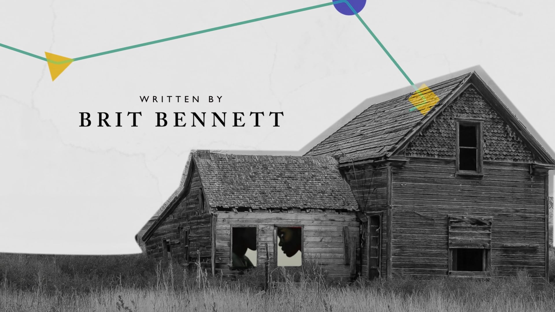
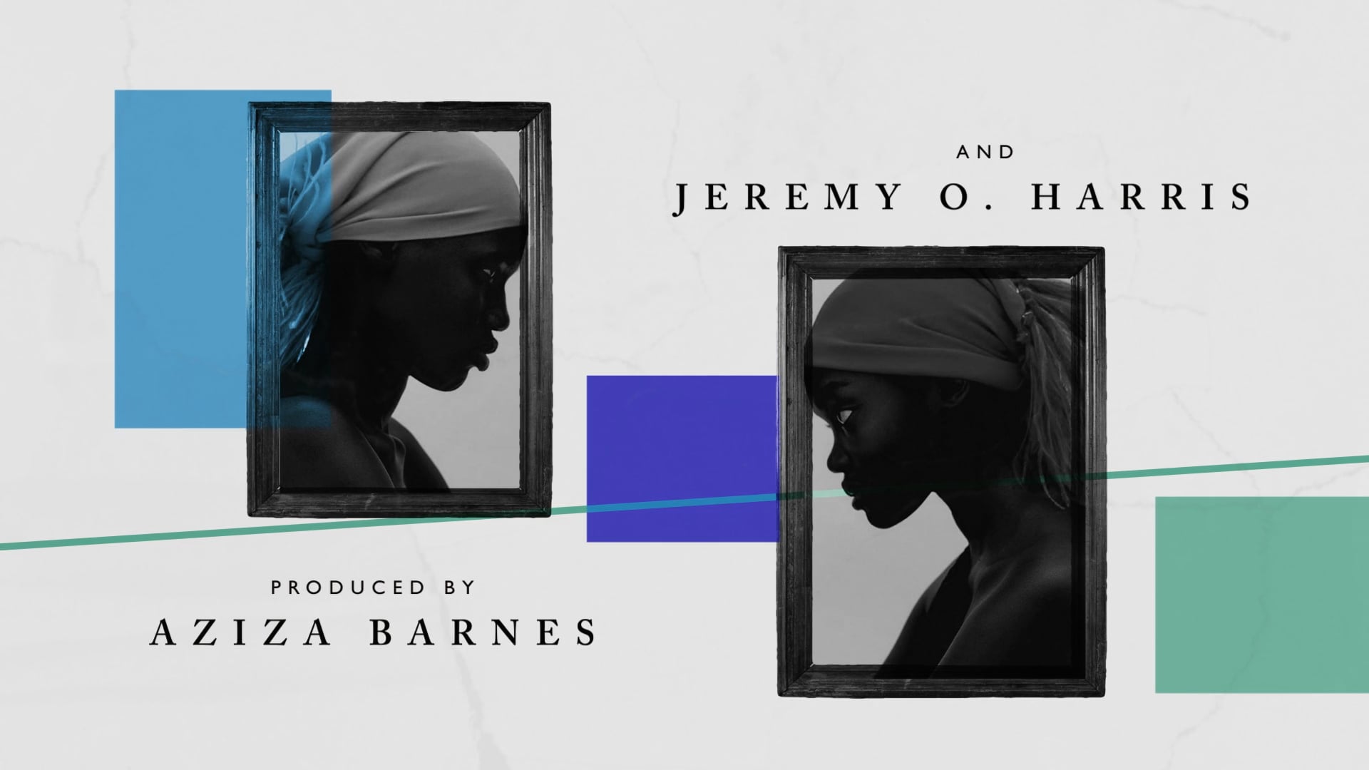
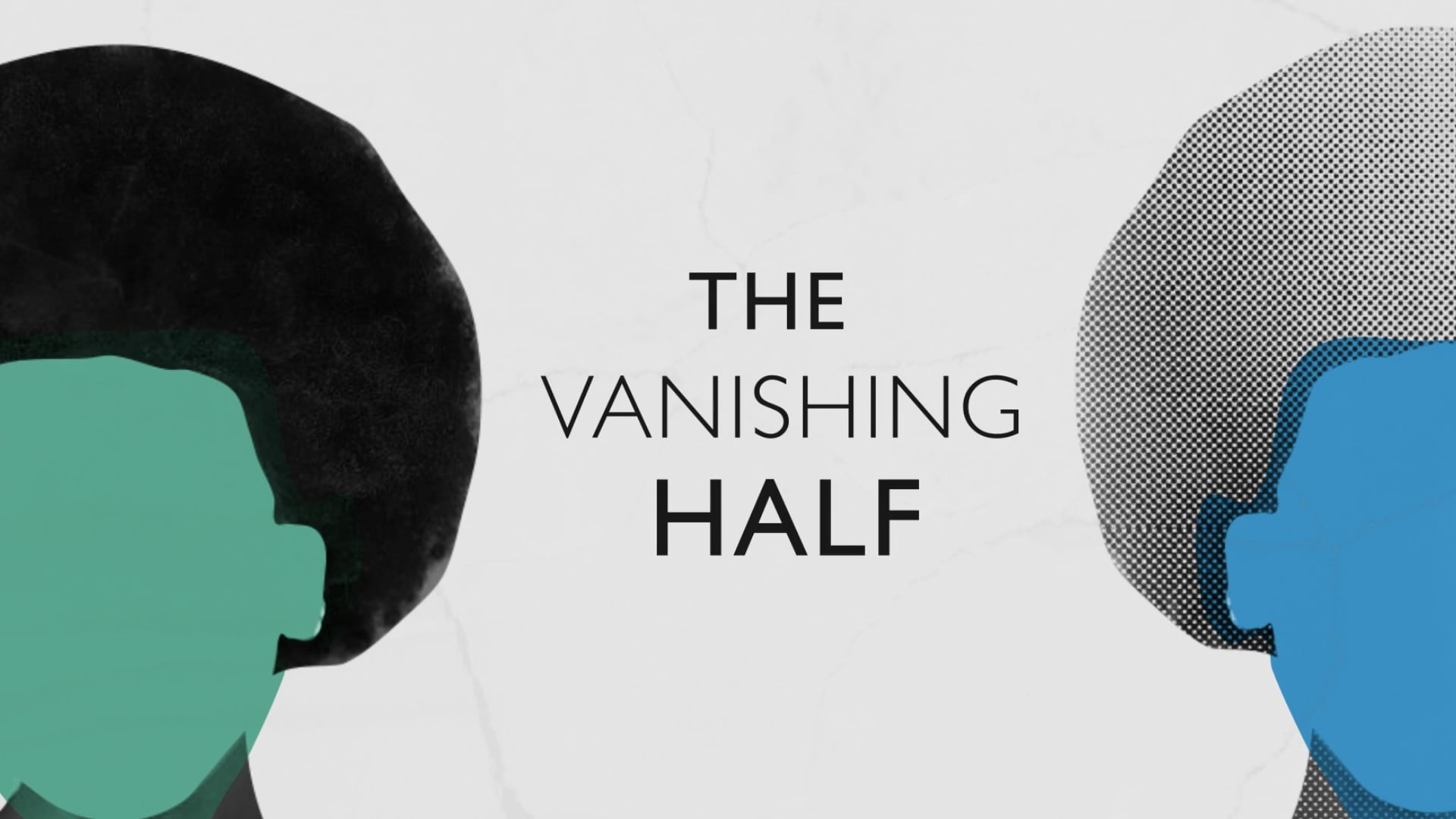
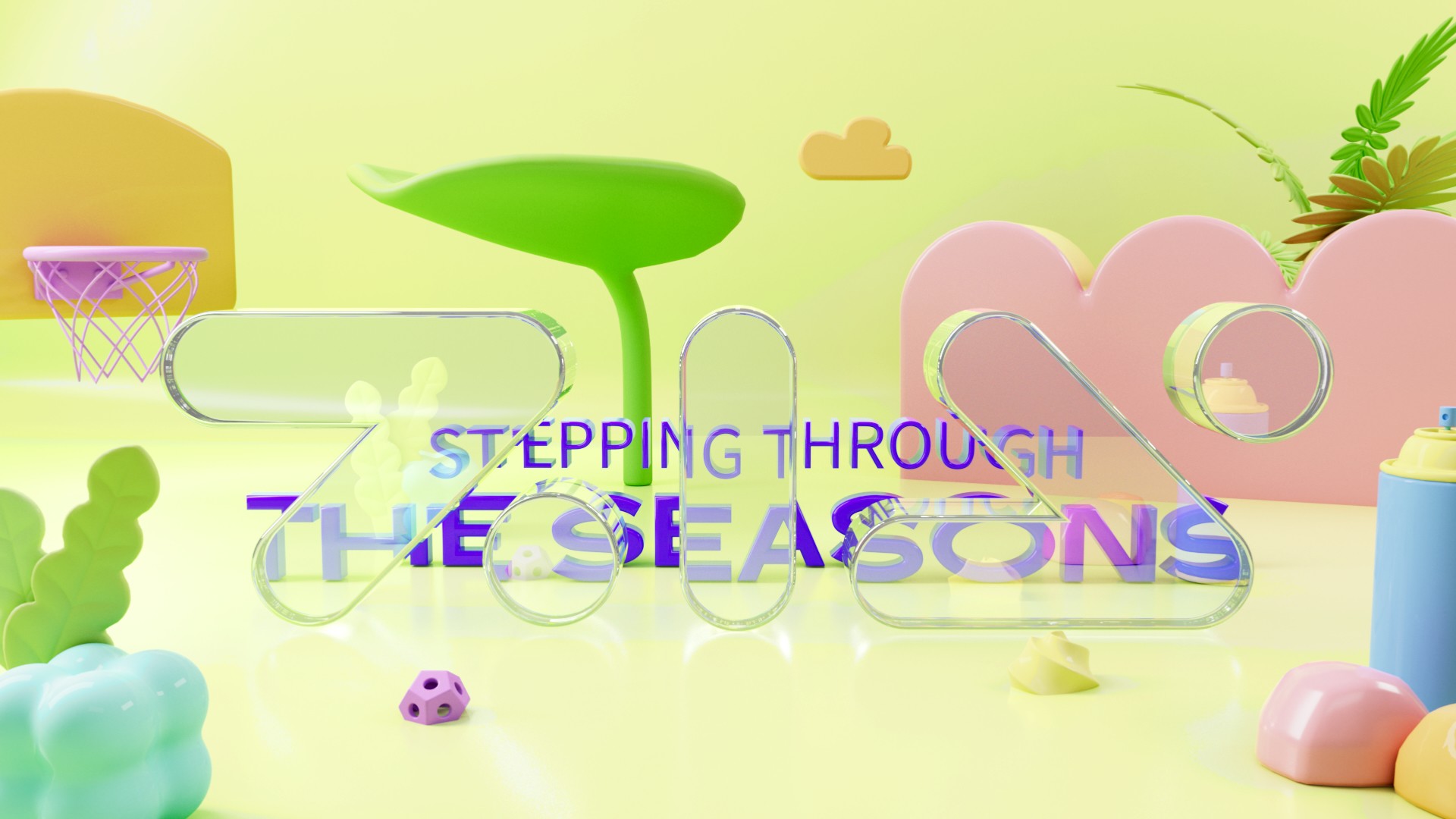
This project demonstrates the creation of an engaging and visually impressive title sequence for the popular book, "The Vanishing Half." This compelling story explores themes of identity and familial bonds, captivating the reader from the start.

This project demonstrates the creation of an engaging and visually impressive title sequence for the popular book, "The Vanishing Half." This compelling story explores themes of identity and familial bonds, captivating the reader from the start.

02

Storyline

02

Storyline

02

Storyline

02

Storyline

1
1

Identical twin sisters, Desiree and Stella, who grow up in Mallard, a small, southern black community

Identical twin sisters, Desiree and Stella, who grow up in Mallard, a small, southern black community

2
2

The sisters run away from home at the age of sixteen, but their lives take different paths.

The sisters run away from home at the age of sixteen, but their lives take different paths.

3
3

Desiree returns to Mallard with her dark-skinned daughter, while Stella chooses to live her life passing as white.

Desiree returns to Mallard with her dark-skinned daughter, while Stella chooses to live her life passing as white.

03

Visual Development

03

Visual

03

Visual Development

03

Visual Development

Color

Color

For "The Vanishing Half" title sequence, I used vibrant colors to reflect themes of identity, duality, and transformation. The palette, from bold blue and orange to soft pink and teal, symbolizes contrasting yet interconnected lives. Pink and blue represent individuality and gender, while orange and yellow signify growth and discovery. Darker green and teal add depth, mirroring hidden identity facets. This palette visually complements the novel's narrative.

Moodboard

Moodboard

Typography

Typography

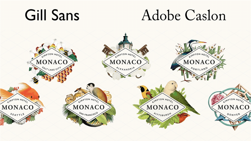
For the typography, I paired Gill Sans (a sans-serif) with Adobe Caslon (a serif). This combination creates a classic, historical feel while remaining approachable for modern audiences.
04

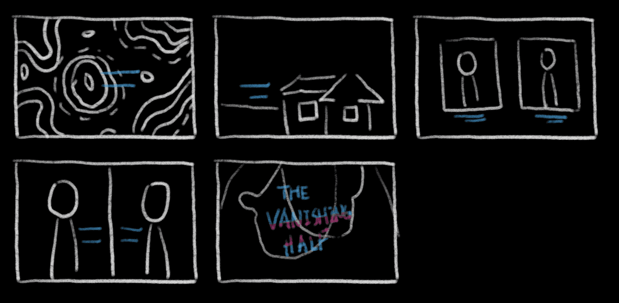
Storyboard

04

Story-board

04

Storyboard

04

Storyboard

05

Reference

05

Reference

05

Reference

05

Reference

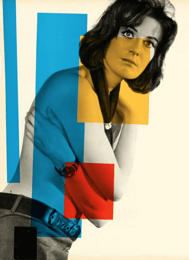
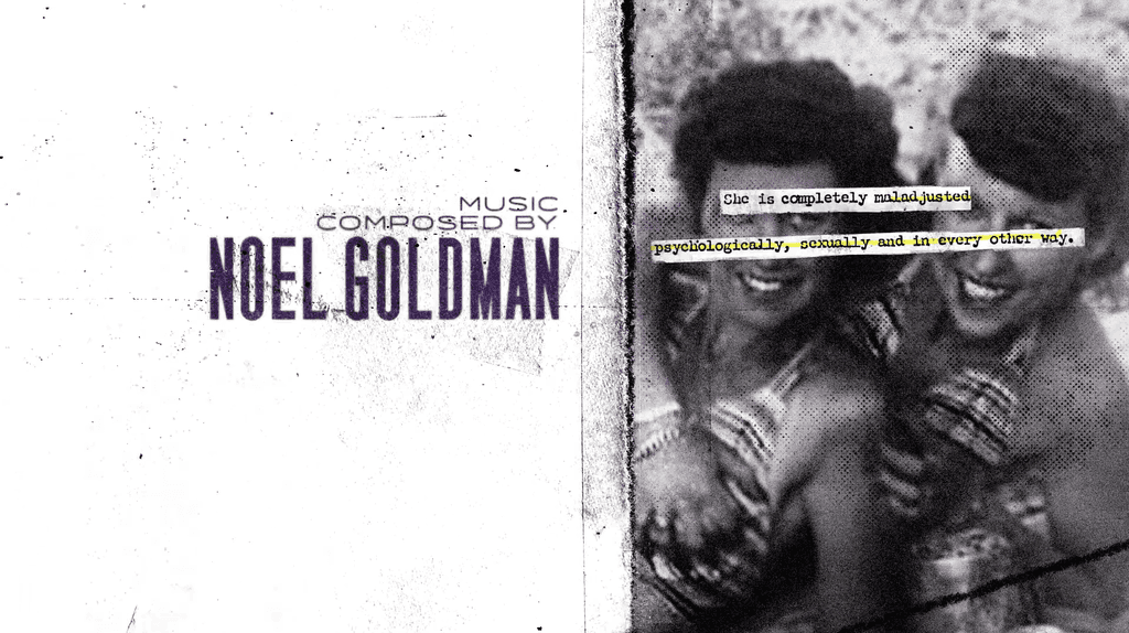
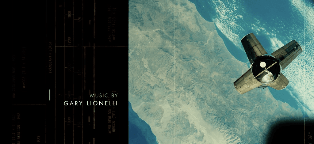
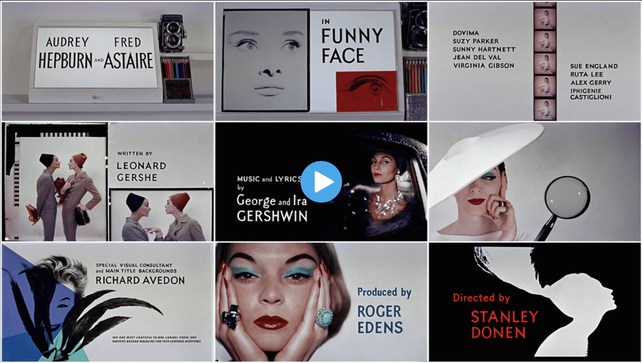
Funny Face (1957)

Funny Face (1957)

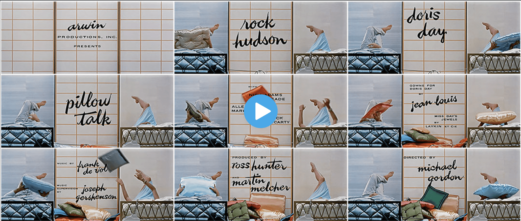
Pillow Talk (1959)

Pillow Talk (1959)